Hello nice people,
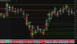
I spent some time playing with the settings of Footprint chart and came with the enclosed Template. I'm happy to share it with you.
- POC in yellow
- Naked POC in yellow + a yellow line
- Unfinished Auction in Fuchsia or light green
- Positive Imbalance in cyan and Negative Imbalance in Orange
- Large Trades (you can modify the threshold) circles in green or red
- On the Top or Bottom of each candle, you have 4 numbers: Green/Red large size = Positive/Negative Delta for each candle, next row total volume of the candle, then two numbers -Bid/Ask % of the candle
- Green/red rectangles on each bar represent Absorptions
- Green / Red thick lines are Support and Resistance plotted automatically by the Volume Imprint Study
- Blue/Red curve: Daily VWAP - dotted blue = VWAP +/- 2*STD
- Below you have the Delta Table with Green/Red being the absolute or relative important figures/changes.
I hope this helps and happy to hear your feedback.
NB: the graph is in French time
One possible way (amongst others) to look at this:
7:50 Buyers have been absorbed at the top of the candle and VI plotted a Resistance at 14858.50
7:55 Stacked Imbalances with the close below the POC + Delta turned red and agressive Delta/Vol% - price crosses below VWAP
8:00 Agressive selling with close below the POC + Delta turned more red and agressive Delta/Vol% - price stayed below VWAP
8:05 selling pressure continues with stacked imbalances + VWAP turned red + CVD turned red ==> I'd have shorted there
9:00 Started opposite scenario with price crossing above VWAP-2*STD
Attachments
Last edited: