Footprint - Absorption

VPOC_trader

Active member
Joined
Oct 22, 2020
Posts
25
Likes
21
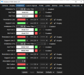
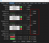
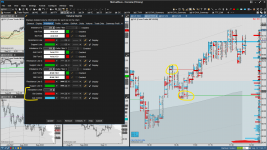
Hello, I am trying to understand absorption and imbalance better... I am wondering if anyone could help me understand the absorption levels highlighted on the chart with respect to my settings? I see both a bid and ask outline. Does the absorption level outline bid color (red) if we have positive delta and the sellers were "absorbed" with a reversal of 25 ticks? I am not sure if my colors are correctly corresponding to the appropriate buy or sell absorption... Thank you..
1663174060023.png
 

Donovan2580

Well-known member
Joined
Sep 13, 2020
Posts
432
Likes
236
I think I can answer your question, but I just wanted to make sure I know what you are asking...

Here is a zoomed in screenshot of the low of ES today with multiple green support lines drawn in automatically by that study. Is your question how / when those green lines are generated? I personally look at the "Ladder" on the volume imprint tool, but the end result should still be relevant.


1663179454595.png
 
Last edited:

VPOC_trader

Active member
Joined
Oct 22, 2020
Posts
25
Likes
21
Hi @Donovan2580 , Yes, partly. I guess I was wondering about the red and green boxes outlined in your screenshot as well.. on mine I have outlined blue and red boxes. I am trying to understand if #1 I am coloring thing correctly based off buying/selling and #2 what are the outlines actually telling me from a bid/ask perspective.
 

Donovan2580

Well-known member
Joined
Sep 13, 2020
Posts
432
Likes
236
In the case of my screenshot above... Let's take the bottom green line for example. That is 377 x 186... Since that is more than double (Or 200%) that green line will print as long as prices are 3 ticks above that price per my settings...

I have all 3 scenario's (200%, 300% and 400%) colored the same because in my experience I have not seen one "work any better" than the other... I think they all work & use this every day. :)

In the case of the 3rd line up from the bottom that would be calculated by comparing 202 x 53 so that would fall under the 300% category as long as prices are 3 ticks above... If prices go below, the line does not appear anymore.

Everything is reversed for the resistance lines of course.

Does that make sense??

Question_Settings.PNG
 

Donovan2580

Well-known member
Joined
Sep 13, 2020
Posts
432
Likes
236
Also that box that you asked about... That is just highlighting the imbalance. If I were to turn off the support / resistance lines that box would still be there showing the imbalance, but the lines would not be shown.

1663180677450.png

1663180730339.png
 

VPOC_trader

Active member
Joined
Oct 22, 2020
Posts
25
Likes
21
Nice, thank you. That does make sense! Now in the case where you just have the outlines showing.. when green outline shows (ask outline), would that mean sellers are being absorbed by buyers? Vice versa for the bid outline? OR, in your example with the low, red outline shows because the selling was being absorbed, and we price reversed off those levels 3 ticks or more?
 

Donovan2580

Well-known member
Joined
Sep 13, 2020
Posts
432
Likes
236
In the example I posted above: Those (The numbers on the left with the red box around it) would be "passive buyers" absorbing people selling "at the market".

For every number on that chart you can make an argument that it could be a seller, or a buyer since it takes one of each to make a trade, so that is the best way it was described to me. 😉
 
Last edited:
Top